
My love for the terminal is no secret around the office. It’s my go-to tool, my natural toolbox. It handles everything I throw at it. But recently, I discovered a Python package that takes my terminal love to a whole new level: plotting!
Who knew you could visualize data directly in the terminal? Plotext brings that superpower to the command line. It’s like Matplotlib, but built for the text-based world.
Plotext isn’t just about basic plots. Scatter plots, line graphs, bar charts, histograms – you name it, Plotext can handle it. It even tackles date-time plots.
But the real beauty? Plotext is lightweight. No extra libraries needed, unless you want fancy features like showing images or YouTube videos (which, let’s be honest, are pretty cool too).
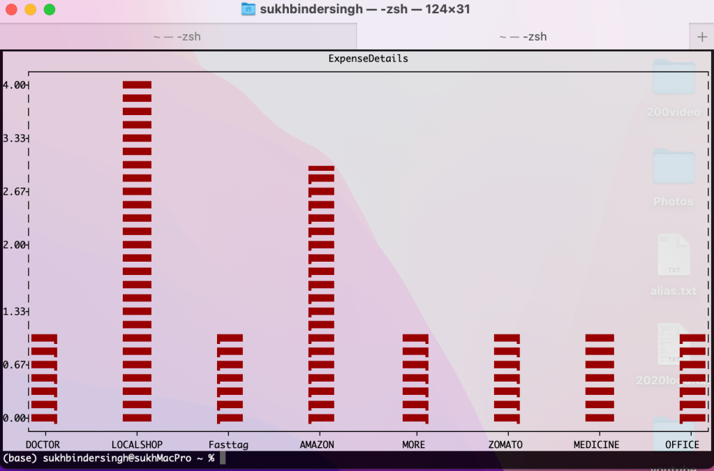
Here’s a taste of how I experimented with Plotext as a command-line application. I grabbed some dummy expense data I had copied to my clipboard and used pbpaste on my Mac (Windows users, check out pbpaste-tkinter) to feed it into Plotext.
Now, I can analyze my spending directly in the terminal – pretty sweet, right?

Before diving into plotting, let’s explore what Plotext commands we have at our disposal. This will help us choose the best way to visualize this data.

Since Plotext is lightweight and doesn’t require external libraries, let’s jump right in and see how to use the bar command to visualize our data. While I will be focusing on bars today, Plotext offers similar commands for scatter plots, line plots, and histograms.

To feed the data into plotext, I’ll use pbpaste to pipe the contents of my clipboard directly into the bar command.

pbpaste | plotext bar -xcol 1 -ycols 3 -t ExpenseDetails -w .25 -c “red”

pbpaste | plotext bar -xcol 1 -ycols 3 -t ExpenseDetails -w .25 -c “red” -f False

Whether you have data in your clipboard or stored in a text file, the process for plotting it with the bar command (or other commands) is very similar. Just provide the file path instead of using pbpaste.


Leave a comment