I am sure everyone one of us has seen charts like this.

Any management training you attend, a version of this chart is bound to sneak up in the presentation, often in lecture notes or hands on activity.
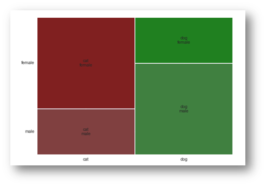
These charts are a good representation of categorical entries. A mosaic plot allows visualizing multivariate categorical data in a rigorous and informative way. Click here to read A Brief History of the Mosaic Display [PDF]
Here’s a quick example how to plot mosaic in python
from statsmodels.graphics.mosaicplot import mosaic
import matplotlib.pyplot as plt
import pandas

gender = ['male', 'male', 'male', 'female', 'female', 'female']
pet = ['cat', 'dog', 'dog', 'cat', 'dog', 'cat']
data = pandas.DataFrame({'gender': gender, 'pet': pet})
mosaic(data, ['pet', 'gender'])
plt.show()
Here’s another example from the tips dataset.

from statsmodels.graphics.mosaicplot import mosaic
import matplotlib.pyplot as plt
import seaborn as sns

tips = sns.load_dataset('tips')
mosaic(tips, ['sex','smoker','time'])
plt.show()


Leave a comment